Lital Dadush
Graphic Designer
PROJECT 1 - Bat Israel 2012
פרויקט "בת ישראל" נוצר במסגרת לימודי עיצוב גרפי במכללת תילתן בחיפה. נושא הפרויקט שבחרתי הוא שובניזם בהלכה. בחרתי לבדוק כיצד ההלכה מתייחסת לנשים, כיצד התורה מתייחסת והאם יש סיבות לכל החוקים הנוקשים שמופיעים בהלכה.
קודם כל, למי שאינו בקיא בנושא, הלכה היא כינוי ביהדות לכלל הדינים והמצוות שעל פיהם מצווה היהודי לנהוג. היא מורכבת מחוקים שעברו בעל פה מאב לבן במהלך השנים.
לאחר מחקר מעמיק, הבנתי שבניגוד לתורה שבה מופיעות לא מעט נשים חשובות שמשמשות תפקיד מרכזי וחשוב במהלך חייהן, בהלכה נשים צריכות להסתתר, לא לבלוט ולא להביע את דעתן. בפרויקט תוכלו לראות כיצד ההלכה משתמשת בפסוקים הכתובים בתנ"ך ומפרשת אותם כפי שהיא רואה לנכון.
בתחילת הפרויקט קיבלנו נושא כללי - פקודות מחשב. כל סטודנט קיבל פקודה והיה צריך לבחור נושא ולהתייחס לפקודה בהתאם.
הפקודה שאני קיבלתי הייתה save as . לכן, בהקשר לנושא שבחרתי, החלטתי "לשמור" את ההלכה אך עם שינוי - ליצור חוקים חדשים שיעזרו לשנות ולקדם את מעמדה של האישה בחברה הדתית.
לוגו הפרויקט נקרא “בת ישראל”. שם זה מגיע מצורת הפנייה לנשים במגזר הדתי, בד”כ עם קונוטציה שלילית מאחר וכמעט תמיד יופיע אחריו נושא הצניעות. אני בחרתי להשתמש בו בקונוטציה חיובית - תיהיי גאה שאת בת, אישה.
הסיסמה שמלווה את הלוגו - כי נבראנו שווים.
לפי מחקר שעשיתי, מצאתי כי ישנן פרשנויות רבות לסיפור הבריאה. שני הפסוקים שמובאים כאן מראים כי האדם והאישה נבראו יחד.
“וַיִּבְרָא אֱלֹהִים אֶת-הָאדָם בְּצַלְמוֹ, בְּצֶלֶם אֱלֹהִים בָּרָא אֹתוֹ: זָכָר וּנְקֵבָה, בָּרָא אֹתָם.” (ספר בראשית פרק א פס’ כז)
“זָכָר וּנְקֵבָה, בְּרָאם; וַיְבָרֶךְ אֹתָם, וַיִּקְרָא אֶת-שְׁמָם אדָם, בְּיוֹם, הִבָּרְאם. ” (ספר בראשית פרק ה פס’ ב)
קונספט הסיסמה מלווה אותי לאורך כל הפרויקט. אם נבראנו שווים אין סיבה שתיהיה אפליה כלפי הנשים.
הלוגו מבוסס מהפונט StamMf ושונה לצורה מעוגלת ונשית יותר. כמו כן נוספו עיטורים שמאופיינים בעיצוב הדתי.
צבעי הלוגו: ארגמן - צבע שמייצג מלכות בתקופת התנ”ך. לאור המושג בת מלך בחרתי בצבע הארגמן כדי לציין כי כל אישה היא בת מלך שצריך להתייחס אליה בכבוד ושיויון. שחור - מייצג את לבושם של החרדים, צבעוניות המודעות שלהם, כמו הפשקווילים. כמו כן, צבע השחור מסמל צניעות.

הלוגו מבוסס מהפונט StamMf ושונה לצורה מעוגלת ונשית יותר. כמו כן נוספו עיטורים שמאופיינים בעיצוב הדתי. לוגו הפרויקט נקרא “בת ישראל”. שם זה מגיע מצורת הפנייה לנשים במגזר הדתי, בד”כ עם קונוטציה שלילית מאחר וכמעט תמיד יופיע אחריו נושא הצניעות. אני בחרתי �להשתמש בו בקונוטציה חיובית - תיהיי גאה שאת בת, אישה.

"ואל אישך תשוקתך והוא ימשול בך"

"כל כבודה בת מלך פנימה"

"הראיני את מראיך, השמיעני את קולך: כי קולך ערב, ומראיך נאוה"


עיצוב סטיקרים, ברושורים ואריזות לגלולות


שמשונית ברחובות חיפה
ראיון בתוכנית "ערב טוב ישראל" בערוץ 1. הצגת פרויקט הגמר 2012
PROJECT 2 - Knesset Snacks 2012
פרויקט "חטיפי כנסת" נוצר במסגרת לימודים בהתמחות אריזה במכללת תילתן בחיפה. קונספט הפרויקט היה ליצור אריזות ממתקים לילדים שלא מעורים בדמויות הפוליטיות בחברה הישראלית. באמצעות הממתקים יוכלו ללמוד על האישים ולהתחבר אליהם. לכל דמות התאמתי ממתק קיים לפי התכונות אופי. פן קצת ציני והומוריסטי כאחד.


מעמד הכנסת נעשה בעבודה ידנית מקרטון גלי


מעמד הכנסת נעשה בעבודה ידנית מקרטון גלי


ליה שמטוב - סגנית יו"ר הכנסת לשעבר (מפלגת ישראל ביתנו) וארז ישכרוב - מנכ"ל מכללת תילתן

ליה שמטוב - סגנית יו"ר הכנסת לשעבר (מפלגת ישראל ביתנו) וארז ישכרוב - מנכ"ל מכללת תילתן


הופעה בעיתון "אקדמיה +" של עיתון הארץ


PROJECT 3 - NJOY - vegan ice cream 2013
פרויקט "NJOY" נוצר במסגרת לימודי עיצוב גרפי באוניברסיטת NBU בסופיה, בולגריה.
Introduction
Due to the increasing exploitation and abuse of animals in the dairy industry, I decided to invent a company called "NJOY" which sells vegan ice cream.The concept of the company is selling vegan ice cream that consist only from
nature, with combination of fruits and coconut milk or soy milk. The idea is to give the people the option to enjoy a great and tasty ice cream and still not take advantage of the animals.
My problem formulation was to bring the sense of nature to the graphic language.
To show that it is an ice cream but different, a vegan ice cream that consist only from nature. The company strategy is focus on the fruits that come from nature, and to show the variety of tastes. During the project you will able to see the stylized icons of the fruits. For this project I chose pastel colors that represent the colors of the ice cream, and throughout the project I used light pastel green which emphasize nature.
Logo building process
My company logo consist from two elements. One is the name of the company and the other is the ice cream icon.
I chose the name "NJOY", the letter "N" represents the word "Nature". Together we get - nature joy!
All the happyness and good in nature. Finding the right logo wasn't an easy task. My guidelines were clear - it's an ice cream but different. I knew it needs to be connected to "nature", and this is how the whole process began.

Two of my first hand sketches.

Three options of the ice cream.
Here you can see different variations for the logo.
For the word "NJOY" I chose the font "Nyala", freed but also organized font (like nature).

After long process, I went back to my sketch book and tried to make the logo look like ice cream but from nature. This time my focus was on the leaf and not the ice cream.

The chosen one - perfect leaf that look like ice cream.
The final logo
The final logo represents vegan ice cream, ice cream that comes only from nature. The shapes, the colors and the name - they all support the concept. The slogan - "sweets by nature" represents the components of the ice cream fruits of nature.

Graphic language - Icons of the fruits - Process
The process of the fruits icons began from choosing the fruits and tastes. I decided to do a stylization to real pictures of fruits.
Clean lines and colors. For example:
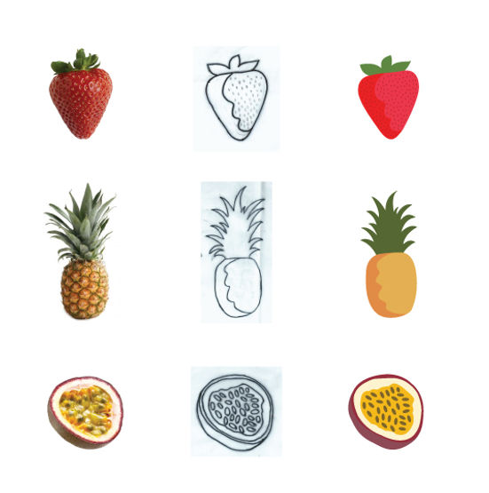
Icons of the fruits
Represent the tastes of the vegan ice cream.


The calendar is design according to the fruits and their seasons. On each month you can see a different fruit. On the bottom there are interesting facts about the fruits. Size: 15x15 cm

Each package has two different flavors inside


To avoid the cold of the ice cream, and if your hand are not clean.


This is a series of three posters. Each poster shows different taste of fruits: Sour, Sweet and Exotic. The concept is an ice cream full of delicious fruits from nature for each part of the day! morning, afternoon and evening.

This is a series of three posters. Each poster shows different taste of fruits: Sour, Sweet and Exotic. The concept is an ice cream full of delicious fruits from nature for each part of the day! morning, afternoon and evening.

This is a series of three posters. Each poster shows different taste of fruits: Sour, Sweet and Exotic. The concept is an ice cream full of delicious fruits from nature for each part of the day! morning, afternoon and evening.

In this billboard I present the tasty ice cream with all the great tastes that nature offers. Just fill your ice cream with your favorite flavors, taste and NJOY!

Here you can see the structure of the store. I used the shape of the leaf for both areas. These shape and color connect us to nature and to the concept of NJOY company.

Sketch of the building, both floors. The first floor is the store and the second floor is designed for meetings. When a private person or a company wants to close a deal for a private event, they go up to the second floor. Also they can taste the ice cream flavors from the tasting bar. The second floor also has toilet and kitchen for the employees, and can be use as a rest area when it is not in use.

First floor of the store from inside. The store is designed with pastel colors like the ice cream, which give a fresh and fun feeling. The tables are designed in the form of fruits: watermelon, melon and coconut. The first floor is divided to two areas. The left side is the main room, the entrance to the store. The right side is the children area, with smaller tables and chairs.

On the T-Shirt appears some of the fruits. To each fruit I associated a human feature, for example: Banana - energy bomb, Lemon - sour puss, Melon - chubby Etc. The concept is the question that appears on the T-Shirt : "How do you feel today?" The answer can be according to the fruits feature. And you can relate the question as "which kind of ice cream you will eat today?"

The wood give the feeling of nature and reinforces the concept.

The concept is "I LOVE NJOY" and "Fruits". On each pin appears different fruit.

The concept is "I LOVE NJOY" and "Fruits". On each pin appears different fruit.

Flash Banner to NJOY Company - Vegan Ice Cream
 גלידה טבעונית - NJOYעיצוב ואיפיון אתר לחברת אנג'וי - גלידה טבעונית |  גלידה טבעונית - NJOYעיצוב ואיפיון אתר לחברת אנג'וי - גלידה טבעונית |
|---|---|
 גלידה טבעונית - NJOYעיצוב ואיפיון אתר לחברת אנג'וי - גלידה טבעונית |  גלידה טבעונית - NJOYעיצוב ואיפיון אתר לחברת אנג'וי - גלידה טבעונית |
 גלידה טבעונית - NJOYעיצוב ואיפיון אתר לחברת אנג'וי - גלידה טבעונית |  גלידה טבעונית - NJOYעיצוב ואיפיו�ן אתר לחברת אנג'וי - גלידה טבעונית |
 גלידה טבעונית - NJOYעיצוב ואיפיון אתר לחברת אנג'וי - גלידה טבעונית |  גלידה טבעונית - NJOYעיצוב ואיפיון אתר לחברת אנג'וי - גלידה טבעונית |
 גלידה טבעונית - NJOYעיצוב ואיפיון אתר לחברת אנג'וי - גלידה טבעונית |  גלידה טבעונית - NJOYעיצוב ואיפיון אתר לחברת אנג'וי - גלידה טבעונית |
 גלידה טבעונית - NJOYעיצוב ואיפיון אתר לחברת אנג'וי - גלידה טבעונית |